Client : Figaro Classified
Position : UX designer
Year : 2020
The case
The subject of this side project is a job board dedicated to tech profiles.
This website offers a matching service between professionals and companies.
Few month ago, the website was re-designed, opening itself to a wider range of digital profiles.
Now the brand answers to the users need by publishing an app.
Goals
Emphase the key features of the website :
- the matching algorithm
- the candidates privacy
- the different ways to apply
Sources : design system B2C, B2C, pages templates
Deadline : 45 days
Deliverables : 5 min pitch + argued choices and process on UX challenge
The process
AGILITY → using my current position ressources
EFFICIENCY → maximizing my work time
INNOVATION → in digital sector
DIFFERENCIATION → standing out from the crowd of job apps
Competitive benchmark
Hired : Direct job offers – Time limited answers
Marco by Job Teaser : Job search assistant
MyOpportunity : Direct job offers – Messenger
LinkedIn : Messenger – Recommandation
Instagram, Facebook : User feed as major line – Powerful and inconspicuous algorithm
Tinder : Navigation – Non-transparent algorithm
Problem definition
The problem is defined by the conjunction of this 3 parts objectives :
Users : Find a job and control my personal infos
Recruiters : Communicate with candidates and speed up the recruitment process
Business : Increasing the number of candidates and their reactivity
Design Thinking methods
I choose to work with an agile and very lightweight structure, mostly because of my restricted time available. I cherry-picked my battles, to get to the essence of the problem. I favoured design thinking methods for their efficiency and tailored them to this « wicked » problem:
- Sketch in early stages
- Collaboration
- Quick release Feedback
- Multiple iterations
Work in progress
Collaborative sketching
This a sneak peek of my live sketch notes during the semi-conducted interviews.

Few identified topics :
- X open seats – Queue systems
- Limited to x offers per day for the candidate and the recruiter
- Messenger
- Tinder-like choices
- Newsfeed
- Cards
- Menu
- Tinder-like choices – NewsfeedCards
- Monetization : IRL meet ups – Starred messages
The promise : not another boring job app
After all these iterations, I came to the conclusion that our app must resolve these problematics
For the candidate
Over solicited → Smart offers delivery
Personal data control → Data settings matched to my goal
Lack of offer → Sourcing « à la carte »
For the recruiter
No answers → Queuing for successful profiles – Monetization of the promotion – Recruiter branding (irl meet ups)
Lack of reactivity → The candidates must reply to all their current job offers to receive new ones
Few profiles → Profile sourcing via internal tools to onboard them on our website
Concepts to explore
IRL
The employer can invite candidates to meet-up and create live events to energize their recruitment process.
→ Social comparison
→ Mass effect
→ Escalation commitment
Limited choice
There is a limited number of offers each day. The user must decide which to decline or to accept to go forward.
→ Need to act fast
→ Immediate rewarding
Smart assistant
The algorithm is based on the user actions. It will allocate the offers, find the best timing for notifications, etc… by itself.
→ Boomerang effect
Defining the user journey…
A daily basic user journey…
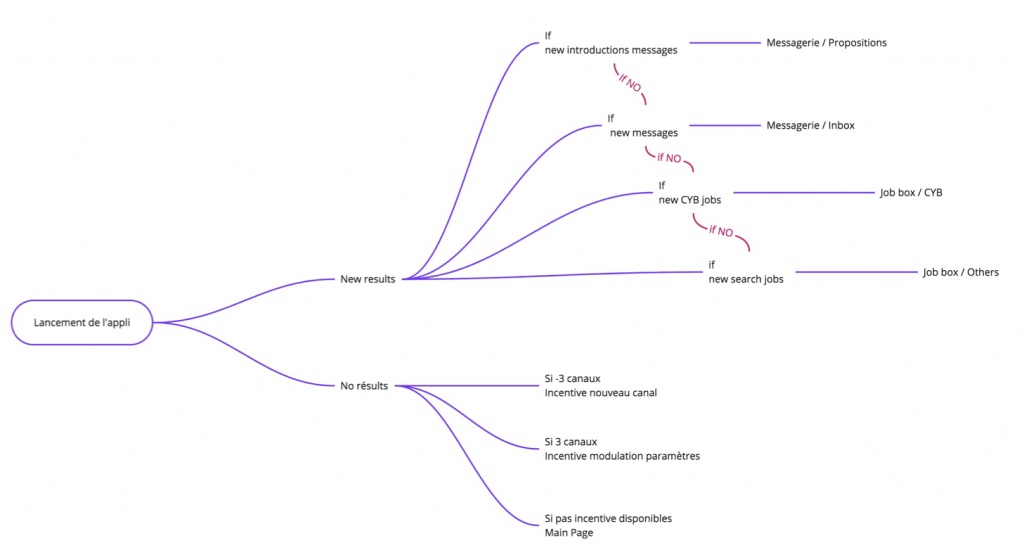
… and the onboarding flow
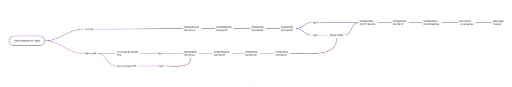
Finally, the job searching app hierarchy
The user panel
For the user interviews and the collaborative sketching, I have worked with key profiles of the website audience. I based my panel on the new persona, with a little twist by adding an « extreme » user :
Programmer
Man – 24 y
The heart of the users group
Product Owner
Man – 30 y
New audience – technophile
Researcher
Man – 37 y
Extreme user – never uses job boards
Customer Experience Manager
Woman – 28 y
New audience – Uses generalists job boards
Marketing manager
Woman – 32 y
New audience – Uses generalists job boards
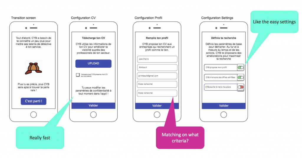
Prototype tests
Because of Covid-19, I had to remote test my prototypes. For more convenience, I used Miro, the collaborative online work service, as a low-fidelity sketch note and a remote testing tool.
Miro possess simple tools to draw and is really easy to handle, even on the first time use. The participants needed only few minutes to be able to navigate the prototypes themselves.


Final conclusion
The feedbacks on the concepts and the prototypes are mostly positive.
There are still questions about :
- The matching process ?
- The human behind the algorithm ?
- Where do the offers comes from ?
The take away and next steps
During this challenge I was able to discover the great potential of collaborative tools like Miro to generate and test my prototypes quickly. I also had to deal with remote testing due to Covid confinement.
In my company, I demonstrated that even in the hurry, you can produce deep concepts and dig into complex problematics, thanks to trough interviews by choosing carefully your participants. The insights we add to the team working on this project were greatly appreciated.
As an individual, I really loved to define the problem trough informal interviews. The users where very opened-minded and enthusiasts about this challenge. I was a cool way to work outside of my product range and explore new features trough a very free design thinking process.
The next step is a new iteration as an high fidelity prototype, made with Figma.
Do you have any comment or want to know more about my process for this case ? Ask me anything in comment section below :
Leave a Comment